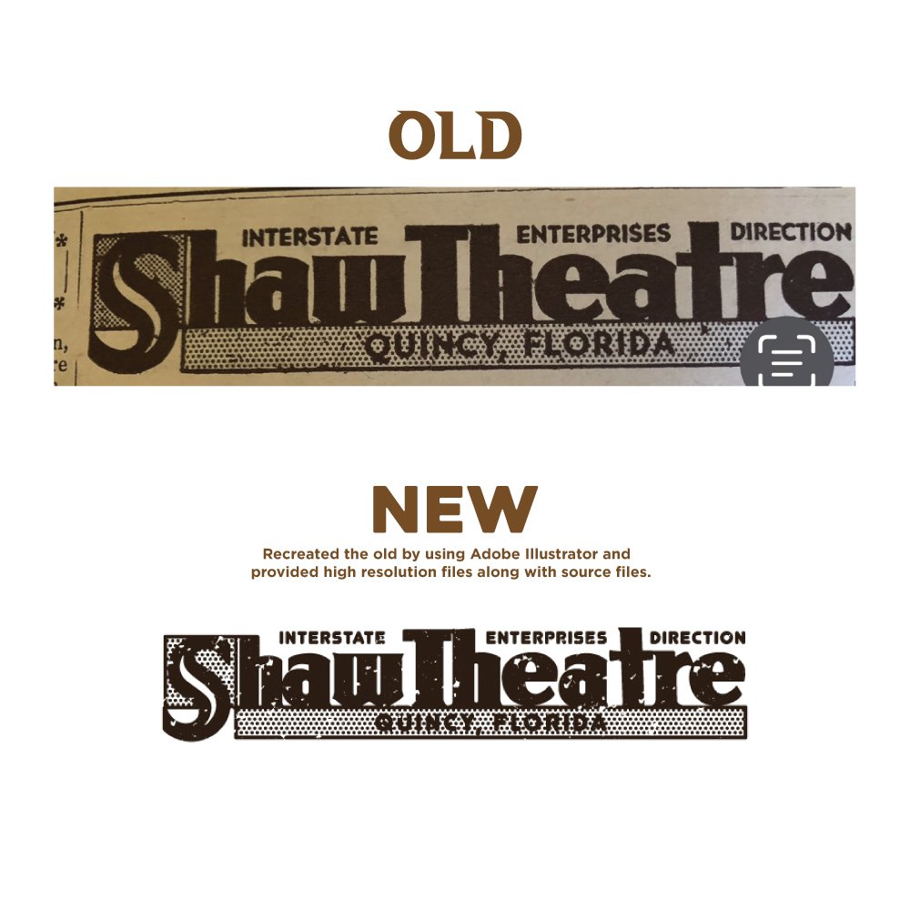
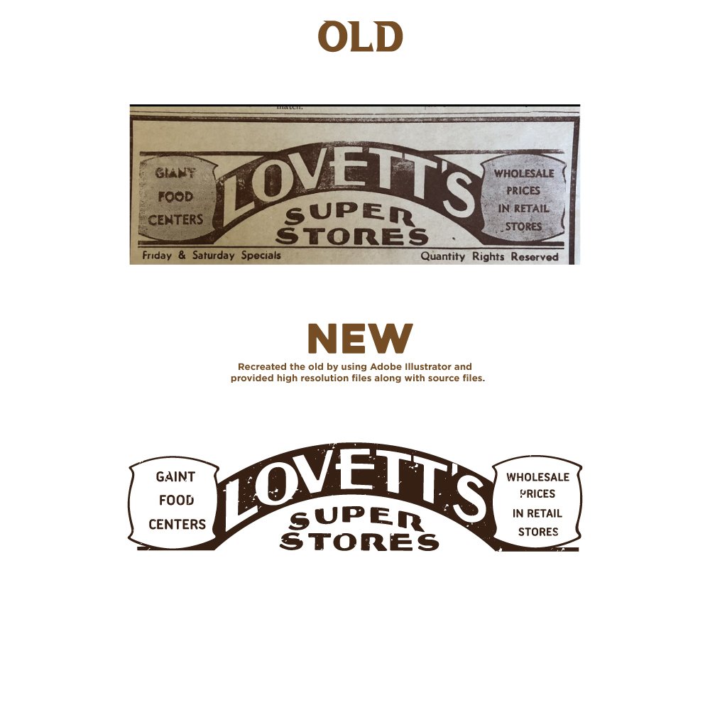
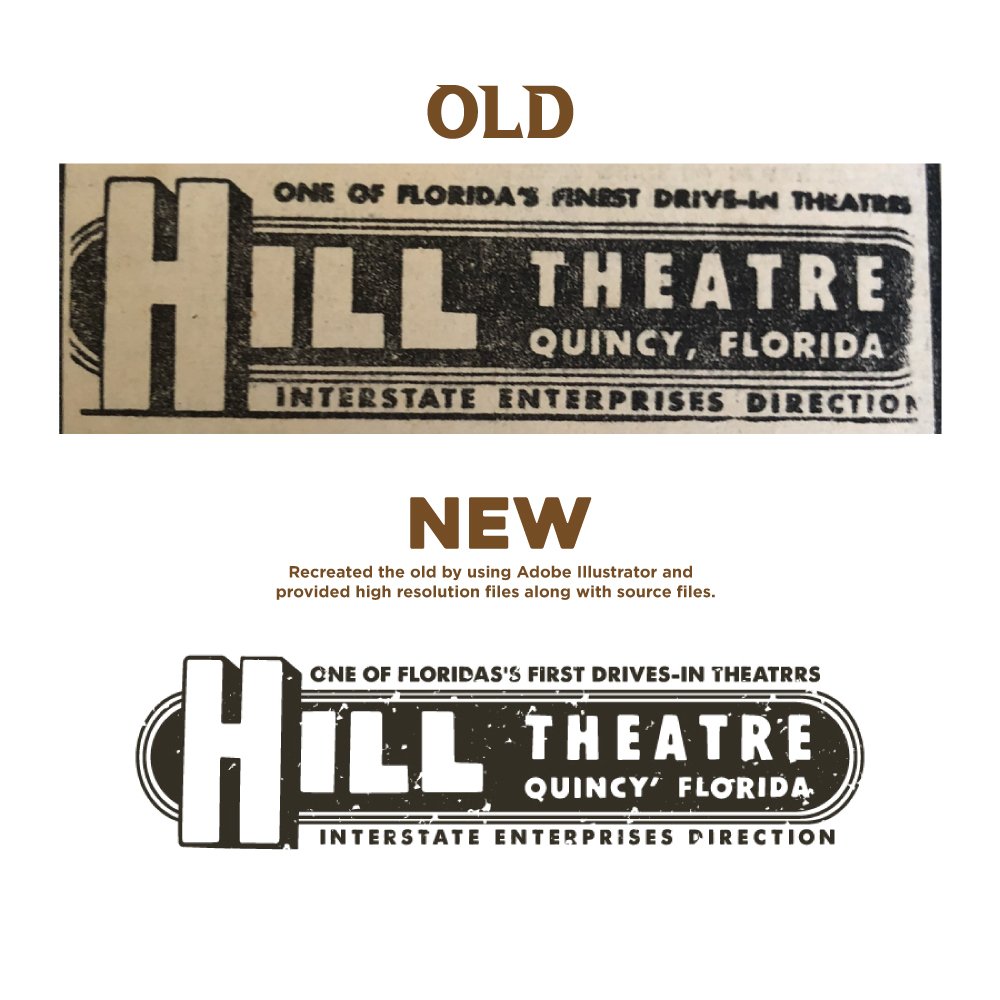
Most logos that need work don't need replacing. They need better proportions, tighter spacing, typography that isn't twenty years out of date, and a colour palette that survives being printed. That's usually where I start. Where a mark genuinely can't be saved, I'll say so — but keeping the equity you've already built is the default, because that recognition took years and costs nothing to preserve.
Best for:
businesses with an outdated logo, brands that have outgrown their original design, and anyone whose only file is a bad one.
What's included:
Review of your current logo and brand history
Two to three refined direction options
Refined typography, proportions and colour balance
Fully scalable, high-resolution vector files
Before-and-after comparison showing exactly what changed
Small-size and single-colour versions tested
Old, then new
Three recent jobs. Use your own redesign pairs here.
Anything not covered here, just ask. I reply within one working day.
Will my customers still recognise it?
That’s the constraint I design to. Unless you specifically want a clean break, I keep the silhouette, the dominant colour or whatever else your customers actually identify you by, and improve everything around it.
What if I decide my current logo is fine?
Then I’ll tell you during the free review and we’ll stop there. Some logos are dated in a way that works for the business, and some just need a proper vector file rather than a redesign.
How many revisions do I get?
Two to three directions, then refinement on the one you choose until it’s right. I’d rather spend the time getting it correct than count rounds.
Can you match my existing brand colours exactly?
Yes, if you have the values. If all you have is a printed sample, I’ll work from that and give you proper Pantone and CMYK references so it stays consistent from now on.
Other things I do
Not quite what you need? One of these may fit better.